EATA Logo Redesign: A Brand Identity Refresh
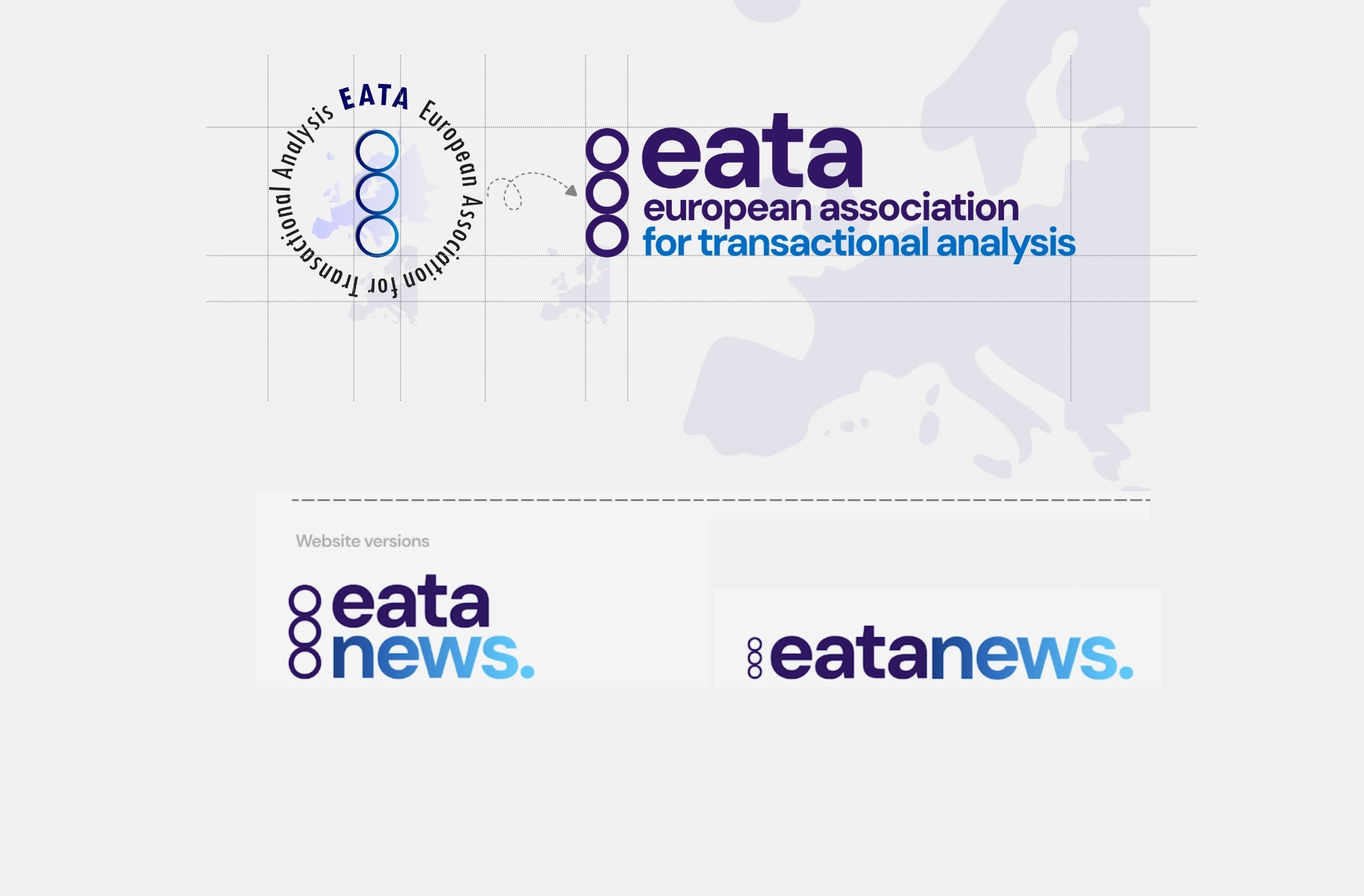
The 2025 EATA logo update refreshed the brand identity for digital use—simplified, horizontal, lowercase typography, a minimalist "fat line" TA icon, and symbolic colors—while retaining the map of Europe as a secondary element within a unified sub-branding system.
2025-26
Year
1 month
Duration
Brand Identity
Category
Framer
Stack
Problem
The original EATA logo struggled with readability at small sizes, visual complexity from gradients and a detailed map, and poor performance on dark or black-and-white backgrounds.
Solution
The redesign introduced horizontal lowercase typography (DM Sans) for legibility, simplified the icon into a minimalist "fat line" TA symbol, moved the map to an optional background element, and tested the identity across formats for full versatility.